
SHOP NOTE: We ship every 2-to-4 weeks in order to batch orders for sustainable labor. We are in a slow period and in some cases this might take a touch longer. For faster fulfillment please order from Printed Matter. Thank you for understanding!


*Print Studio No Longer In Service*
Due to changes in our studio staffing and project goals, as of spring 2024 we no longer print for new clients. Works for existing clients may be possible, but cannot be guaranteed. Please allow time for communication as we now maintain irregular office hours.
To access printing at TXTbooks we will offer seasonal workshops.
In the interest of Riso-academia this page will remain live as a resource for anyone interested in learning more about Riso.
Thanks for your support and understanding!
Printing

Thanks for visiting our printing guide and F.A.Q. We cover a range of topics referenced in the menu (left) in as much detail as possible for those new to Riso, or those planning a specific project. The details contained are somewhat universal, but tailored to our mission and abilities. While the guide itself is a tad long, please find some more quick context below.
Introduction
You might be asking..."What The Hell Is A Risograph?" The Risograph is a "Stencil Duplicator," a business machine reminiscent of a Mimeograph that was meant for small institutions to produce in-house copies, which has been replaced by copiers and in turn repurposed by the arts community for edition printing. It uses liquid ink drums as spot colors to create 1-to-2-color editions at high speeds.
The simplest way to describe the process is cross between a digital copy machine (Sending a PDF with encrypted file instructions to printer) and silkscreen printing (Burning a screen, passing liquid ink through a mesh, having to reclaim screen to produce a new image.)
We, along with other studios around the world, are now using it in ways it was never *really* intended, creating printed material that the machine’s original target consumer would never seek out. This contradiction informs our process and philosophy as a studio.
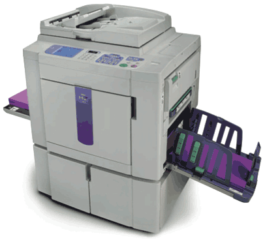
Okay... THIS!
What is Risograph Good At?
What is Risograph Bad At?
It's good at making a lot of the same thing very fast. It's good at making beautiful and saturated colors you can't get in other accessible forms of printmaking. It's good at heavily aestheticizing your work. It's good at feeling inherently special.
It's bad at perfect representation of image (though it always looks good). It's bad at perfectly precise color registration (though it's always charming). It's bad at 100% batch consistency (though it's always close). It's bad at small-batch and individual sheet printing (though if you really want to just print one, you can always do it).
To continue the thread above, Risography is somewhat limited in it's strengths, so not every project should be (or needs to be) Riso. However, there are great ways you can play to it's strengths. Here are a few project samples we've helped produce:
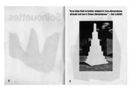
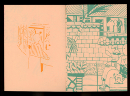
1-Color Artist book for Cooperative Editions.
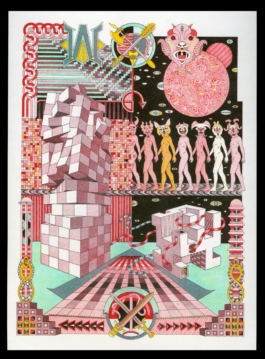
WOR by Jess Johnson, a 4-Color 11x17 Printed Edition for Printed Matter, Inc.
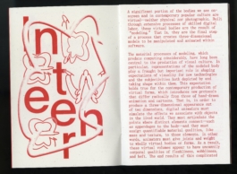
1-Color Zine, commissioned by CCS at Bard College.
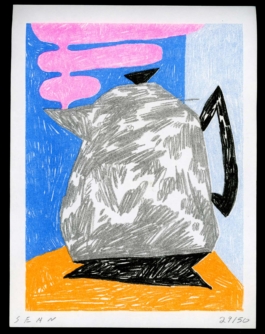
5-Color Artist Print for Sean Suchara.
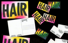
5-Color Postcards for Hair, LA.
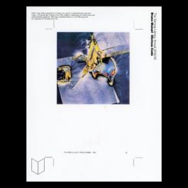
4-Color Single-Sheet Insert for Bruno Munari's Codice Ovvio, Commissioned by The Serving Library.
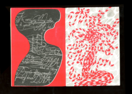
2-Color zine for Mel Nguyen & Little Paper Planes
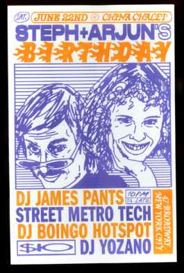
2-Color Birthday Poster For Steph and Arjun, designed by Braulio Amado.
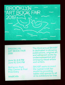
1-Color Info Postcards for Brooklyn Art Book Fair.
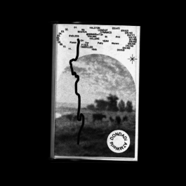
1-Color Cassette J-Cards for Greenhouse Records.
Each of these projects is planned smartly for Riso, which will become clearer as you read through the guide. To see more featured projects we've produced for artists, institutions, friends, and many more, check our print gallery or follow us on instagram.
The single biggest consideration for Riso is figuring out how you want to work within the limitations of the printer & inks to produce an image. For example, take this original drawing and riso translation by Thomas Colligan:
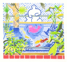
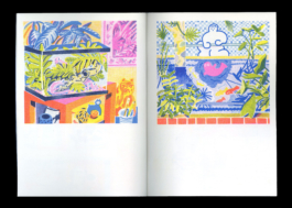
Thomas Colligan
(And yet a trace of the true self...
...exists in the false self).
Essentially, we take the color channels of the original and choose a palette and manner to translate into a Riso facsimile.
So...
how
does
this
happen?
[1]
Basic Riso Image Handling
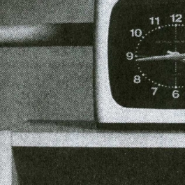
The Risograph reads images by their greyscale values, scanning the document for highs, lows, and mids, producing an image stencil in corresponding manner. Below is an example of source, and reproduced image with the two standard options for image handling.
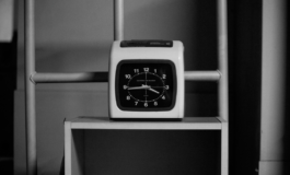
Robert Blair
Original Greyscale Source File
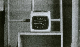
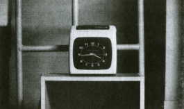
Image-Mode: Grain Touch
Image-Mode: Screen-Covered, 72dpi
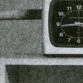
Grain Touch Detail, an automatic dither effect applied by the Risograph
Screen-Covered Detail, a dot screen applied by the Risograph when printing. We have the ability to control the density of the lines-per-inch, gaining more image control.
[2]
Printing in one Color
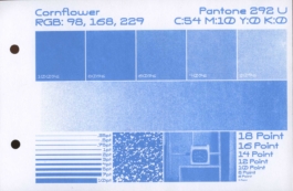
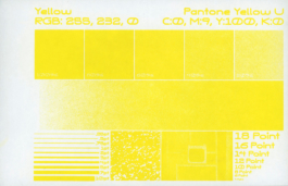
Each layer is translated from a greyscale document into a desired color by physically selecting the drum you place into machine.
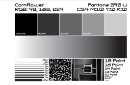
Original Greyscale Source File
One Color Risograph Print in Cornflower
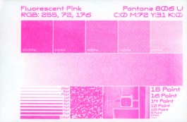
Exact same color-grade in Flo. Pink.
Exact same color-grade in Yellow.
[3]
Printing & Mixing Color
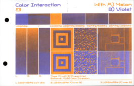
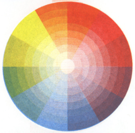
Certain Risograph colors are translucent and as a result are very favorable for overprinting and creating new colors. This can be fairly intuitive and gestural by using basic color theory to explore and create new colors. It can also become extremely scientific, using color profiles to try for optimal image reproduction. Both are great, the latter is a bit tiring!
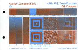
An overprinting example in Cornflower and Copper.
An overprinting example in Violet and Melon.
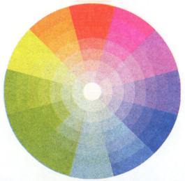
Color Wheel Test in Yellow, Fluorescent Pink, and Blue. Because none of these colors have white pigment, they all have a clean color interaction.
Color Wheel Test in Yellow, Bright Red, and Cornflower. Because Cornflower has white pigment in it and Bright Red is a bit dense, they all have a muddier color interaction.
[4]
Duotone Color Printing
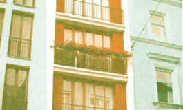
The the most economical (and prevalent) Risographic method is two-color facsimile printing, which simplifies the range of color in the original image into a simplified riso palette, the general logic of this being "One Light, One Dark" or "One Warm, One Cool."
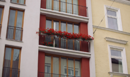
Robert Blair
Original Image
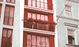
2-C Riso with Red and Black inks.
The same 2-C Riso with Melon and Green inks.
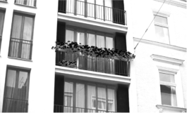
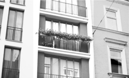
Layer 1 (Red/Melon)
Layer 2 (Black/Green)
Prepared by converting your image to CMYK and then batching the Cyan and Black channels into one color, and Yellow and Magenta into another. You can find a tutorial for this on our resources page.
[5]
4-Color Reproduction
You can prepare CMYK images for risography by simply converting your document to CMYK in photoshop, going to your channels tab, and clicking the hamburger menu in the top right, and then selecting "Split Channels." Generally we advise to delete or down-mix your black layer from layer beneath it.
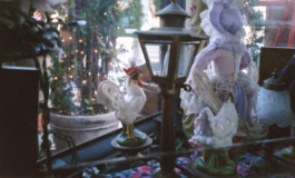
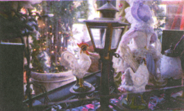
Robert Blair
Original Image
4-Color Riso with Flo. Pink, Cornflower, Yellow, Black.
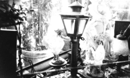
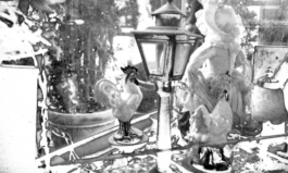
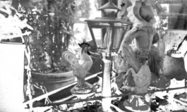
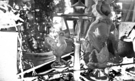
The print layers from left to right: Black, Yellow, Flo. Pink, Cornflower. Prepared by prepping CMYK files in photoshop.
[6]
Printing In Multiple Flat Colors
After viewing the previous examples, the below probably appears much more simply. For multiple layers, we simply select colors similar to the original, and print them in according order.
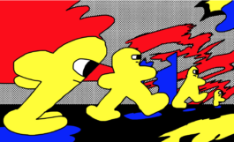
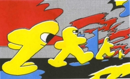
Kurt Woerpel
Original Digital Drawing
4-Color Risograph Printed Image
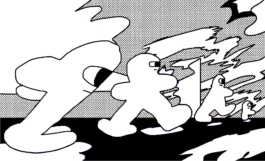
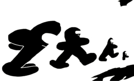


The print layers from left to right: Black, Yellow, Red, Blue. Prepared by using the select-color-range method.
Typography
Typography is relatively easy to nail for Riso, but requires a bit of consideration during design and attention in file-prep.
(Click)
(Click)
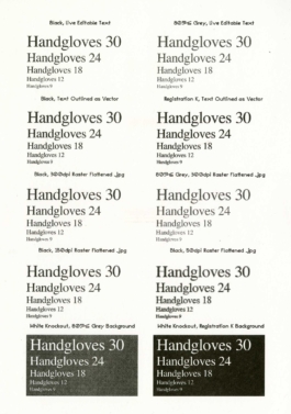
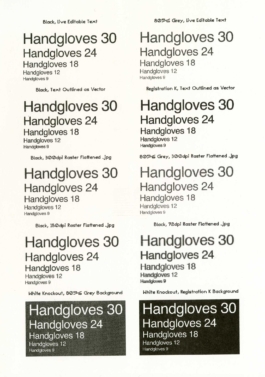
Do not send flattened typography as .jpgs or other raster files.
Convert from Live editable type to flattened vector shapes.
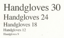
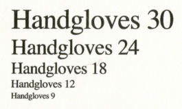
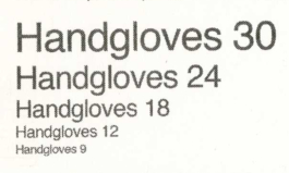
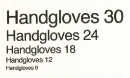
The machine has two types of data it looks for in print files: Raster (Pixel-dependent) and Vector (pixel-independent) data. It reads both of these independently and therefore grants control over how they are treated, granting more clarity to vector files over image files. So, if you send typography baked into a flattened JPG or even TIFF image, you are sending the type as image data rather than "line" data. The solution is to always set typography over your finished image using a program like indesign and following the steps in this guide. If you can't do this, send with at least 300 DPI.
Above is an example of the intricacies brought about in the data handling from "live"editabe typography vs. flattened vectorized typography. By outlining (CMD+O), you push the clarity of the type to be read as line rather than a hybrid file.
Convert your vectorized typography from "Black" to "Registration"
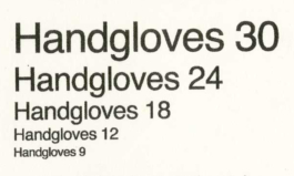


To get maximum clarity from your type, convert your completed (now outlined) typography from "Black" to "Registration." In the PDF metadata, Registration is read as a 100% flood of color, while "Black" is read as a 90-something-percent tint, which can cause dots to be created in the internal letter forms.
Be Mindful of Knockout Type
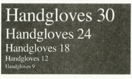
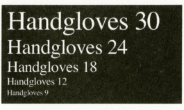
White type printed on solid flood background will have a natural tendency to fill in as the paper absorbs the printed ink. This will naturally make your typography appear smaller and less legible when printed in an inverted style. We also advise against knockout over more-than-one color, as you will have misaligned multi-color bleed-in.
Setting Colored Typography
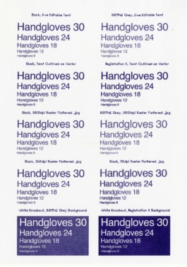
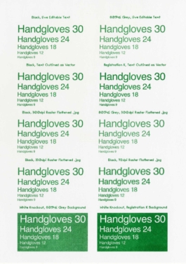
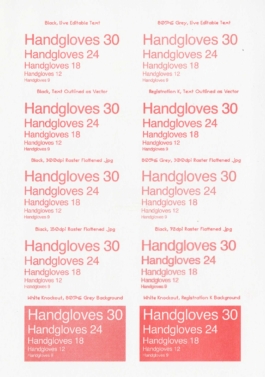
Some inks work quite nicely for denser moments of typography. Consider using a color in the place of black. Dark and mid-tones tend to work perfectly fine, while lighter tones will begin to suffer a bit.
Minimum Point Size

The minimum size we can reasonably print is around 8 or 9 points. Anything below that is not recommended.
Imperfection
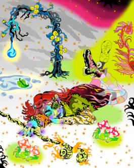
Printing Riso demands building imperfection into your process. Color can shift in approximation of an image [A]. Multiple colors will not align to each other perfectly[B]. Color coverage can vary across large patches of ink [C]. Paper can smudge on contact with rollers or other sheets (especially with higher ink densities) [D]. Images close to the edge of the sheet can have difficulty filling in [E]. The image can skew from front to back & ETC, ETC, ETC.

[A]
Color Range Shift
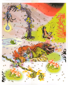
Nichole Shinn
As mentioned in detail above, your color range will always shift from digital to print, regardless of chosen method or color range.
[B]
Typical Mis-registration
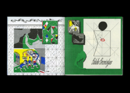
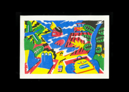
Left: Anibal Bley, Right: Thomas Colligan
Mis-registration is inherent to the Riso process. This is caused as multiple sheets pass through the machine to layer up multi-color images and hit in different places, or if print drums are warped or skewed. For certain pieces, You can solve mis-registration by designing your images with trapping, designing in a very forgiving manner (so it looks good regardless), or just accepting that this might happen regardless. We do our best, but a little mis-registration will always occur and we can't prevent all of it.
[C]
Color Tide / Block Color Variance
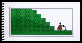
Rose Wong
Larger fields of color will always be subject to a "tide" mark, or visible printed variance in color. This can't be helped on-press, but can be mitigated by limiting open space in your design. Some hate it, some (we) think it's part of the charm.
[D]
Roller Marks
Needle Mark
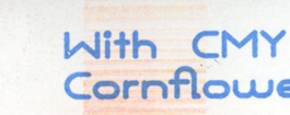

Roller marks are caused when layering more than two colors on a single sheet as the paper passes underneath the rubber feed roller into the machine, picking up ink from previous layers. This is lessened when running ink lighter, or not running heavy color centrally through the print sheet.
Needle Drag is caused by having too-much open ink area on your print sheet, causing it to not want to separate from the ink drum as it passes through the printer. This is specifically worsened if you have more ink very centrally on the sheet/image. If you want to avoid roller marks, use less ink. As a rule of thumb, when larger fields of color must be 80% opacity black.
You can see examples of both of these in certain spots on our website (if you choose to look.)
[E]
Print Area Edge-Fading
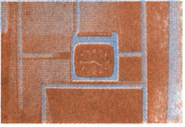
Robert Blair
This is caused by placing your image too close to the edge of the print sheet. Usually this doesn't happen and is something we can mitigate on our end, but can be avoided altogether by placing images more centrally on the sheet.
Printable Area
Risograph can print up to 11x17 inches (Tabloid) sheets of paper down to 8.5x11 inches (Letter) sized paper. We can't print larger or smaller, sorry! Printable area falls roughly .25 inches from each side of the overall sheet size. For example, the maximum image size for tabloid would be 10.5x16.5 inches. That said, giving half an inch is safer for quality control purposes.
Sheet Size
Safe Zone
Modifying Scale
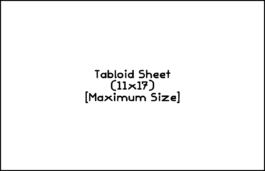
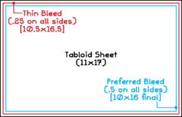
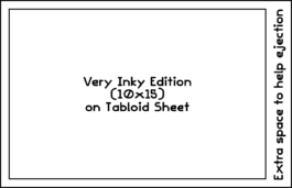
We print on 11x17 "Tabloid" sheets as our maximum size into the printer. This is a standard U.S. paper size which is double the dimensions of "normal" printer paper. We also print on normal printer paper, which is 8.5x11 "Letter" paper. We don't print other sizes!
We cannot print full-bleed through the printer, so images must be scaled down. The preferred scaling allows for a .5 in. margin on all sides, but you can cut it slightly closer if you are alright with faded edges.
For fully inked or heavily saturated printing, images must be scaled down to avoid complications. Further, our maximum crop length is 15 inches. If you submit heavily inked prints without sufficient margins, we will downsize your print on our end.
Sheet Size
Booklet Sizing
Ganging Up
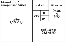
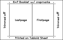
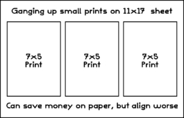
In terms of paper scaling, this is the general breakdown of how sheets are trimmed down to produce new sizes, or how they result in printed matter.
When printing booklets we ask for extra "handles" on the sides of the sheet so we can handle the paper safely. Best practice is 6x9 maximum size, though 8x10 is also possible (for full crop.) If you want an 8.5x11 final book size, you will not be able to trim at all.
If you are looking to print a larger edition, consider making your work smaller so you can save money and paper. This is an economical way to work, especially if you are using a simpler ink-palette. You do lose a bit of precision, but makes up for it in pricing.
Front and Rear
There is no automatic duplex printing when printing Riso, meaning all page flips have to be done by hand. Due to this, front and back do not align 100%. In addition, there is a natural shift inside the machine and circumstancial skew on each unique color drum. We can get it very close, but be advised there may be a slight shifting.

Riso Colors
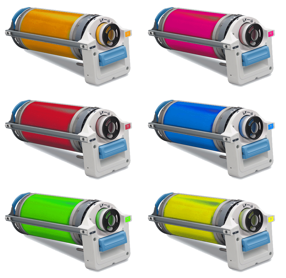
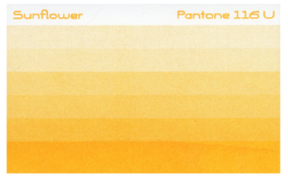
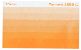
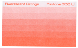
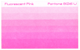
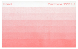
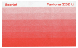
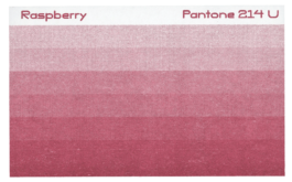
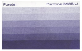
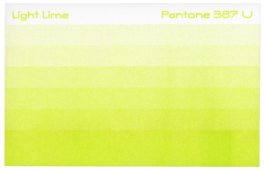
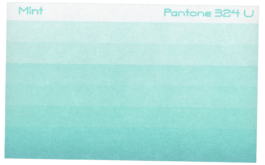
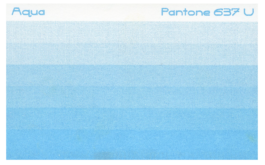
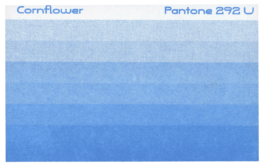
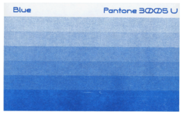
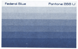
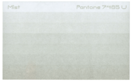
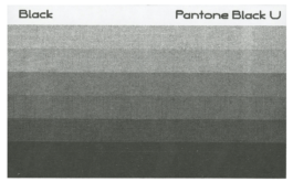
As mentioned, each Riso color is pre-mixed and contained in individual color drums. We currently stock 22 standard colors:
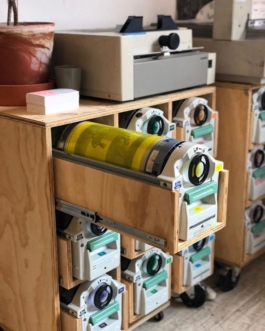
Yellow, Sunflower, Melon, Fluorescent Orange, Red, Raspberry, Coral, Fluorescent Pink, Violet, Purple, Federal Blue, Blue, Cornflower, Aqua, Mint, Light Lime, Green, Hunter Green, Bright Olive, Copper, Black, and Mist.
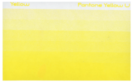
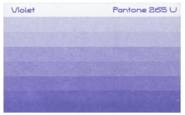
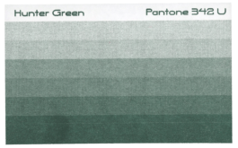
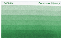
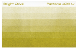
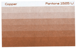
As a premium color, we stock Metallic Gold...
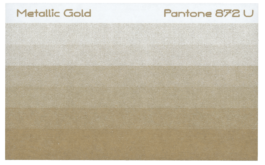
...Which, along with Mist and a few others, can be used to print on darker paper stocks.
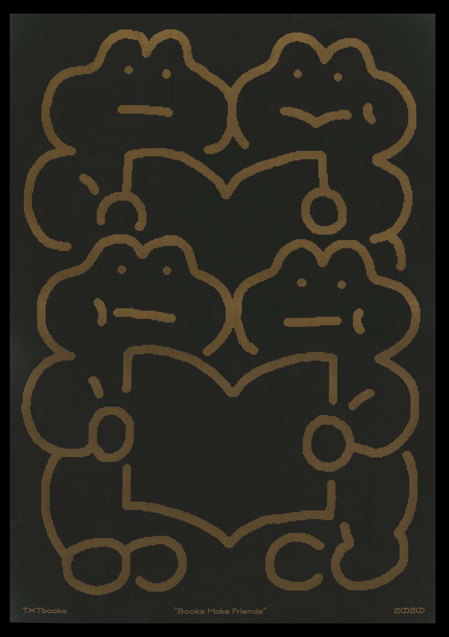
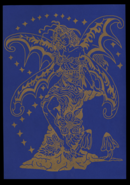
Adobe Swatch and color reference is available at txtbooks.us/resources. Our colors rotate a bit seasonally, but are more-or-less stable to the above!
Paper
Paper is the most important aspect of Riso printing. It determines how the project feels, sets a baseline for all ink to be compared against, and varies greatly in ink absorption and color handling.
Standard paper we keep stocked
We carry a standard Bright White “International Accent” Vellum in 70# Text which is great for book interiors and fliers, with a matching 80# Cover, which is great for book covers and poster printing.
We also carry a heavy-weight “Williamsburg Hi-Bulk” Vellum in 75# Text which is great for shorter hybrid projects which require heavy block inking and a bulky feel
Premium Artist Paper We Stock
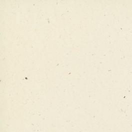
•French Paper Speckletone True-White 65# Cover (Off-White with Flecks, shown above)
•French Paper Pop-Tone Whip Cream 65# Cover (Cream)
Selecting a Paper Stock
Do you want your project to feel bulky? light? cheap? expensive? Are you feeling cheap? or expensive? Are you charging money? Are you giving it away? Who is it for? Can you experiment with color? Or finish? Or size? Are you flexible? Are you specific? Consider the above.
Consider Colored Paper
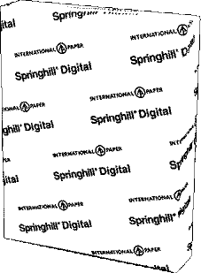
As mentioned previously, printing with a colored stock can push a project into new exciting territory and assist with budgetary concerns. Printing with a specific and well-considered colored stock along with one or two agreeable Riso inks ALWAYS works and is our suggested "hack" to work smart with the printing process. Recommended colored paper stocks are French Paper Pop-Tone, Mohawk Via Vellum, Neenah Astrobrights, Springhill Digital Vellum.

Order Your Own!
We are happy to help you order and ship paper to our studio. In fact, we prefer this! It gives you more control and allows for projects to become more fine-tuned to their needs. However, we do have strict parameters for paper we will print. From experience, imperfect paper will jam the machine and result in poor printing and damaged material. For large jobs we are happy to help special order paper, but additional fees will apply.
Paper Requirements
Cover Stock: 60#-100# Cover weight, 80# Preferred.
Text Stock: must be between 60#-100# Text weight
Finish: Vellum or "Offset" finish preferred. Must not be gloss/coated in nature.
Disallowed paper stocks
•Extremely thin paper (clogs the printer)
•Construction paper (we can help source mock-construction)
•Newsprint (we can help source mock-newsprint)
•Extremely heavy paper (Will not feed)
Don't know what to buy? Buy one of these!!!!
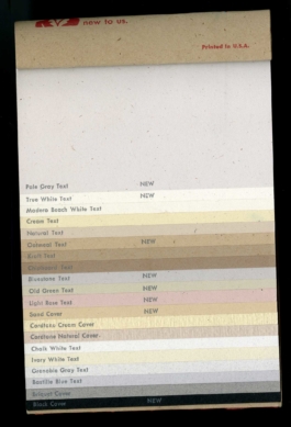
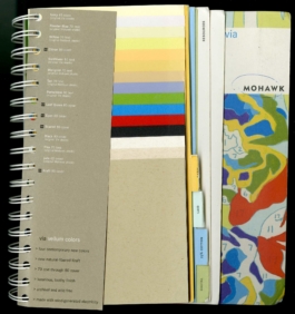
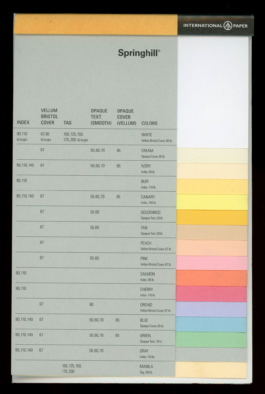
We suggest anything from the French Paper "Speckletone" or "Poptone" lines, these are high-quality, affordable papers, which are made by hydro-electric power at an independently-owned mill. Speckletone is made using recycled stock and has visible pulp flecks, Poptone is an amazing and colorful line we use on many projects. This paper generally has a bit of a nice feel in-hand.
Mohawk's Via Vellum line is a great, moderately pricier, alternative to the Poptone paper line. It has lots of great options for whites and a few poppy colors.
Springhill Digital is a great trade-paper line that gestures at the classic "Staples Pastel" copy paper you can buy at the so-named office supply stores and find at workplaces across the country. This paper comes in slightly thicker sizes than the staples stock and as a result is a better option for Riso specifically. It's very affordable and feels a bit less fancy. Cause it doesn't always need to be fancy!
Binding
Binding refers to the method of gathering and affixing your printed sheets into collated book format. There are lots of ways to do this, but each require consideration. There are many binding methods out there, but binding methods we offer are listed below.

Saddle Staple
Spiral Bind
Side-Staple
Perfect Bind
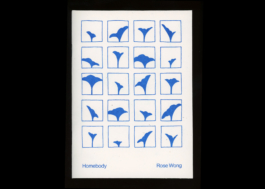
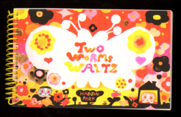
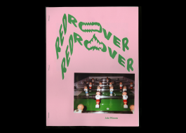
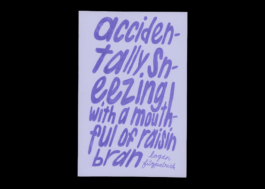
Saddle-Stapling is the simplest and most ubiquitous method for binding short for printed matter. You simply gather your sheets, then staple, then fold... in some kind of order like that. We sometimes do this by hand, and sometimes using a binding machine.
Spiral binding is done by collating and pre-trimming your book block, then puncturing the sheets with a spiral punch, then inserting and crimping coils. Due to the labor, we do not spiral bind projects over 24 pages.
Side-Stapling is a very simple bind which can be applied with standard staples for short projects, or industrial "heavy duty" staples for longer pieces. It can give a perfect-bound feel with a simple application and can be done at home.
Perfect binding produces what most would refer to as a "paperback" book. This process involves gathering the sheets and compressing them intro the paper stock with hot glue. This is for longer projects of 64+ sheets and is a bit expensive due to the effort and materials.
For small and medium sized projects (under 32pp.) we do Saddle Stapling, Side Stapling and Spiral Binding. Collaborators are encouraged to bind projects themselves in their own homes or studios.
File Prep & Delivery
Quicklist
"A Riso print is only ever printed
as well as its files are separated."
—well known saying

PDF CREATION
For each color layer you want to print, Make a 300 DPI PDF in Greyscale at actual size and labelled by color, exported as single pages (as opposed to spreads.) For example a 2-color print would be: “filename_red.pdf” and “filename_black.pdf.” Repeat this process for each page and enclose full-color reference images when necessary.
COLOR FLATS
For any large color flats, reduce to 80% opacity. Beware large flats may smudge and we may alter your file slightly for optimal printing. Color flats will always have a variance in color coverage, sometimes called a "tide mark."
COLOR MIXING
Colors mix better when you pair two lower-to-medium opacity colors with each other. For example 50% Red and 50% Blue will combine better than running both at 100%. This has to do with the density of the liquid ink and the physics going through machine and onto paper.
MULTI-COLOR FILL
For any areas of color-fill or block-color printing, consider adding “trapping.” These are areas which “line” and “fill” overlap each other to create a pocket of double ink, rather than white space, during color alignment. The above is an example of a poorly trapped and poorly aligned image.
COLOR SEPARATION
There are many different ways to create color separations from a multi-colored file. Whether you use a color profile like colorlibrary.ch to automatically create basic channels, follow a youtube tutorial, or wing it, there is not necessarily a wrong way, just different ways. We have some tutorials on our resource page if you are interested.
TYPOGRAPHY
For any small typography, convert to from “live type” to outlines (cmd+o) and change the fill color from black to “registration black.” Do not set type below 7pt. Beware white type on black background will fill in slightly.
IMAGE TREATMENT
Do not pre-apply any halftones to images, the riso will do this.
EFFECTS
Flatten all effects and transparencies on complicated documents, otherwise you may get undesired artifacts in your print
BLEED/TRIM
Allow for at least 1/4 an inch on all sides of printed sheet (full bleed print is impossible, but trimming is possible.) Add crop marks if necessary.
RESOURCE CONSERVATION
Consider printing multiple images on a single sheet, or “ganging up,” to save resources and double output when possible. Sheets can be trimmed to create multiples. On this same note, ask yourself if your project could be less pages, less ink, etc.
IMPERFECTIONS
Be aware slight color skew and other imperfections may occur and is a normal feature in this method of high-speed high-volume printing. Think “newspaper” rather than “fine photo print.”
FURTHER QUESTIONS
Feel free to reach out with any specific questions.
This section is available both as a single web page and as a printable PDF for reference.
Project
Work-flow

As seen in this guide page, Risography is quite different from at-home inkjet/laser printing, yet a bit scrappier than offset or similar high-level print counterparts. To help you get a better idea of how it works on our end, we've separated the process into a few basic chunks.
Pre-Press
Printing (on-press)
Binding & Finishing


This period comprises everything that takes place before delivering your print files. It includes...
Designing, Researching & Selecting Paper, Viewing Ink Swatches, Selecting Ink, Creating Color Separations, Proofing, Emailing, Project Managing, Etc.
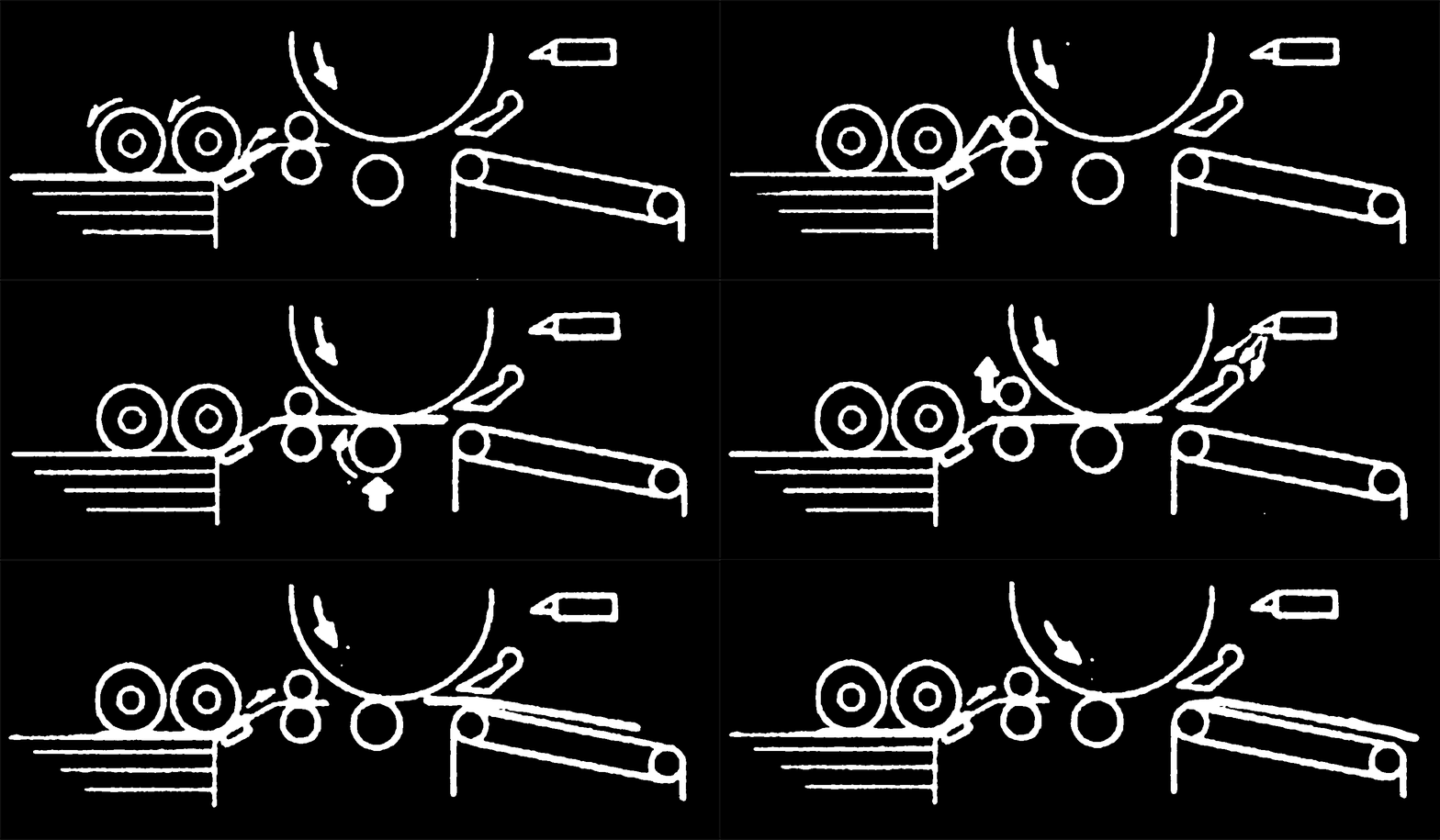
1) We send a single page from your PDF to the printer, to the desired drum.
2) The printer reads the file's greyscale values and encoded data to generate its interpretation of your image
3) The printer creates a thermal "master," akin to a silk screen, and wraps it around the color drum.
4) The printer pulls a sheet of paper from the paper feed tray into the machine.
5) The color drum rotates as the paper is fed through the machine, leaving a color "impression" on the sheet of paper.
6) We inspect and align the color as needed on the sheet, and interlock it with any existing colors.
7) We run the edition, making adjustments as needed, and the paper exits the machine in a stack.
8) We take the stack & jog it into a neat and flush pile, ensuring that it goes through the machine in a consistent manner.
9) we repeat steps 1-6 for each color on each page of the entire project.
10) Once complete, we allow to stack-dry for a few days to allow the ink to set before moving onto the finishing process.
1) We clear a surface (or surfaces) and lay out each printed sheet, all facing in the same direction, in first-to-last order. For larger projects this can become a long chain.
2) We gather one of each sheet, stack in order, then trim and then cross-reference your preview PDF to bind a single dummy.
3) Once we've confirmed the correct order, we cycle through sheet stacks to produce a stack of organized books.
4) We quality-check to ensure each page is properly printed as we collate.
5) We bind in the appropriate method, pre-trimming any needed sides to ensure clean. This is sometimes done using a semi-automatic saddle-staple binder. Sometimes this is done by hand-stapling. Or hand-punching the book blocks, etc. It can become quite intimate.
6) We begin the trimming process, gathering anywhere from 5-20 books at a time depending on size, trimming one side at a time beginning with long edge then following up with short edges. This is done using our semi-automatic stack-cutter.
7) We inspect the bound editions to check on any post-production needs such as erasing smudges.
8) We wrap, bag, or otherwise package prints for pickup and place on our "outgoing" shelf.
9) We arrange a pickup or prepare for mailing.
Turnaround
Risograph printing can be quite time-consuming depending on your needs and project specs, so understanding the timeline and our studios workflow is important.
Small Projects
For all projects up to 32 pages with reasonable specs we require at least two weeks from final file delivery, meaning your approved and cleared PDF, to final printing. This does not include shipping time. This schedule has to do with balancing press time, conflicts, troubleshooting, and individual work schedules on our end.
Larger Projects
For projects above 32 pages or with otherwise more complicated specs, timelines can vary dramatically. For an accurate timeline for larger projects, send us an inquiry outlining your needs.
Rush Fee
For rush jobs requiring quick turnarounds from file delivery to pickup, a rush fee scaled against the time crunch will be instituted. This can range from 20-50% depending on complexity.
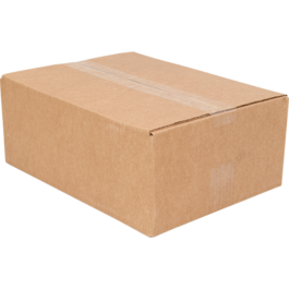
Studio Pickup
We are happy to coordinate pickups from our Bushwick studio on Mondays and Fridays during normal business hours.
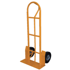
If you plan to pickup, be advised projects can be quite heavy, so a car or dolly are advised.
Shipping Your Project
We are happy to pack and ship projects for a slight materials & handling fee, the shipping cost covered by artist. We have a great relationshio with the USPS carrier in our zone, but are happy to work with your preferred carrier.
Production Time
Our turnaround window begins when final files are delivered, not from first correspondence. Please make sure that you plan accordingly and relay files in a timely manner.

Special Attention

Here are a few things which are less directly related to anything, but worth mentioning.
Our Print Studio
We are primarily a publisher with the print shop as an outgrowth of our original mission. We operate our print services on a part-time basis, lead by a single print-technician who comes in as needed with a minimum of one press day per week. We batch work in order to create a schedule and balance demand.
Our Priorities
Due to our size and limited schedule, we cannot accomodate each job inquiry we receive. We prioritize projects which are managable in scale, well-suited for riso, and reasonable in deadline. If we cannot accomodate you, we will refer you to another capable studio.
Be Sure To Send Correct Files
If you send us a file, we will print it. We are neither editors nor proofreaders and do not know your project as you do. If you send us a PDF with any mistakes, we will not know and can't guarantee we'll catch them. Any mistakes we do catch are a courtesy but not the rule.
We cannot be held responsible for file problems and project delays or additional costs (namely reprinting) that may result from a mistaken file delivery.
Payment
All Payments can be handled via PayPal, Square, or Bank Transfer. We do not accept Venmo. Cash is OK. We have separate workflows for larger or smaller jobs.

Smaller jobs can be completed with payment prior to or upon pickup.
Larger jobs require 50% upfront, 50% upon delivery due to their unwieldy nature.
To request a quote, please email us at studio@txtbooks.us and include the following for a quick response:
*Please note that as the top of this page mentions, we no longer offer printing services. However, these are good things to provide for any other printer you reach out to.

1) Did you read our Print Shop Info above?
2) Have you printed Risograph prints before?
3) Are you an Individual Artist/DIY publisher, a Design Studio/Agency, a Small Business, or an Activist/Mutual Aid Org ???
4) Is this for project for you or for a client?
5) List your specs (Project type, page count, colors needed, overall editions, due date, note our sample projects)
6) Will you buy your own paper or do you want a house stock?
7) Do you want to bind and trim, or do you want us to?
8) Do you have any questions, project concerns, or general needs?
9) When do you need this project finished?
Thanks for your interest and please allow us a few business days to respond.

Please note, we no longer offer printing services, so this page is purely for informational purposes.
On a phone, you don't get the full picture...
This guide has been cut by 90%.
Please view on Desktop for the full guide.
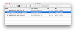
PDF CREATION
For each color layer you want to print, Make a 300 DPI PDF in Greyscale at actual size and labelled by color, exported as single pages (as opposed to spreads.) For example a 2-color print would be: “filename_red.pdf” and “filename_black.pdf.” Repeat this process for each page and enclose full-color reference images when necessary.
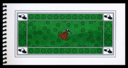
COLOR FLATS
For any large color flats, reduce to 80% opacity. Beware large flats may smudge and we may alter your file slightly for optimal printing. Color flats will always have a variance in color coverage, sometimes called a "tide mark."
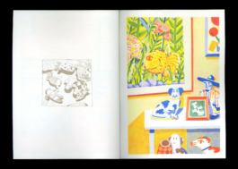
COLOR MIXING
Colors mix better when you pair two lower-to-medium opacity colors with each other. For example 50% Red and 50% Blue will combine better than running both at 100%. This has to do with the density of the liquid ink and the physics going through machine and onto paper.

MULTI-COLOR FILL
For any areas of color-fill or block-color printing, consider adding “trapping.” These are areas which “line” and “fill” overlap each other to create a pocket of double ink, rather than white space, during color alignment. The above is an example of a poorly trapped and poorly aligned image.


COLOR SEPARATION
There are many different ways to create color separations from a multi-colored file. Whether you use a color profile like colorlibrary.ch to automatically create basic channels, follow a youtube tutorial, or wing it, there is not necessarily a wrong way, just different ways. We have some tutorials on our resource page if you are interested.


TYPOGRAPHY
For any small typography, convert to from “live type” to outlines (cmd+o) and change the fill color from black to “registration black.” Do not set type below 7pt. Beware white type on black background will fill in slightly.


IMAGE TREATMENT
Do not pre-apply any halftones to images, the riso will do this.

Flatten all effects and transparencies on complicated documents, otherwise you may get undesired artifacts in your print.

BLEED/TRIM
Allow for at least 1/4 an inch on all sides of printed sheet (full bleed print is impossible, but trimming is possible.) Add crop marks if necessary.

RESOURCE CONSERVATION
Consider printing multiple images on a single sheet, or “ganging up,” to save resources and double output when possible. Sheets can be trimmed to create multiples. On this same note, ask yourself if your project could be less pages, less ink, etc.

IMPERFECTIONS
Be aware slight color skew and other imperfections may occur and is a normal feature in this method of high-speed high-volume printing. Think “newspaper” rather than “fine photo print.”

FURTHER QUESTIONS
Feel free to reach out with any specific questions.
Thanks for reading but...
On a phone, you don't get the full picture!
This guide has been cut by 90%.
Please view on Desktop for the full guide.